TABLE OF CONTENTS
- How to access the Intervals IQ report?
- The Intervals Overview Tab
- The Key Events Overview Tab
- The Analyse Tab
The Interval IQ report in Rocketlane is used to analyse Key Events & Intervals across projects and templates in your Rocketlane account. You can measure project performance and time to value for each individual deliverable by analysing its interval against other intervals and their benchmarks.
You can read more about Key Events & Intervals here.
Note: The Report only displays trends and reports for completed intervals.How to access the Intervals IQ report?
From the left navigation bar, go to Reports.
Click on Interval IQ from the reports page.
The Interval IQ Report has three tabs:
- Intervals Overview
- Key events Overview
- Analyse

The Intervals Overview Tab

The Interval Trends Graph
The 'Intervals trends' graph displays the Average Interval Duration in days versus the Interval Completed time depending on the month/week in which the interval was completed.
Each line in the graph represents a saved interval. You can hover over any graph line and the tooltip will show you the name of the interval, its actual duration, planned duration and the number of projects used to calculate the average value and the time when this interval was completed.

The Interval Deviation Trends from Planned Duration Graph
The 'Interval Deviation Trends from Planned Duration' graph displays the 'Average Interval Deviation' versus the 'Interval Completed time'. The Average Interval deviation is the deviation between the actual duration and the planned duration of an interval.

Each line in the graph represents a saved interval.
You can hover over any graph line and the tooltip will show you the name of the interval, its deviation in number of days (negative value represents early completion and positive value represents late completion or delay) and the number of projects used to calculate the average value and the time when this interval was completed.
List of Intervals Table
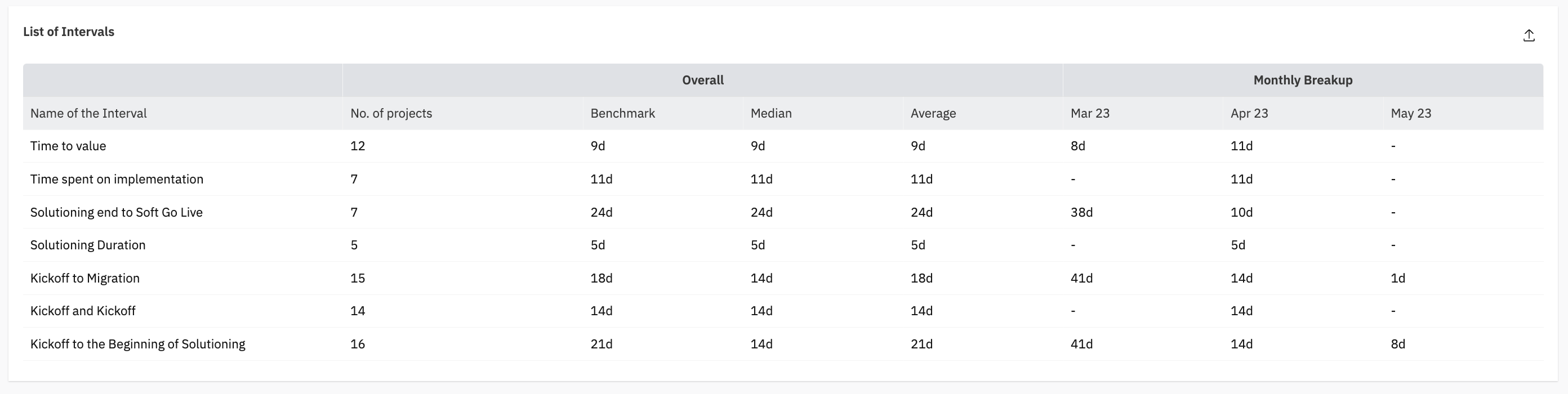
This table lists the captured Interval's name, Benchmark value, Median duration, Average duration and the Monthly/ Weekly breakup based on the Interval completion date.
Note: Benchmark refers to the Planned duration of the Intervals.The Key Events Overview Tab
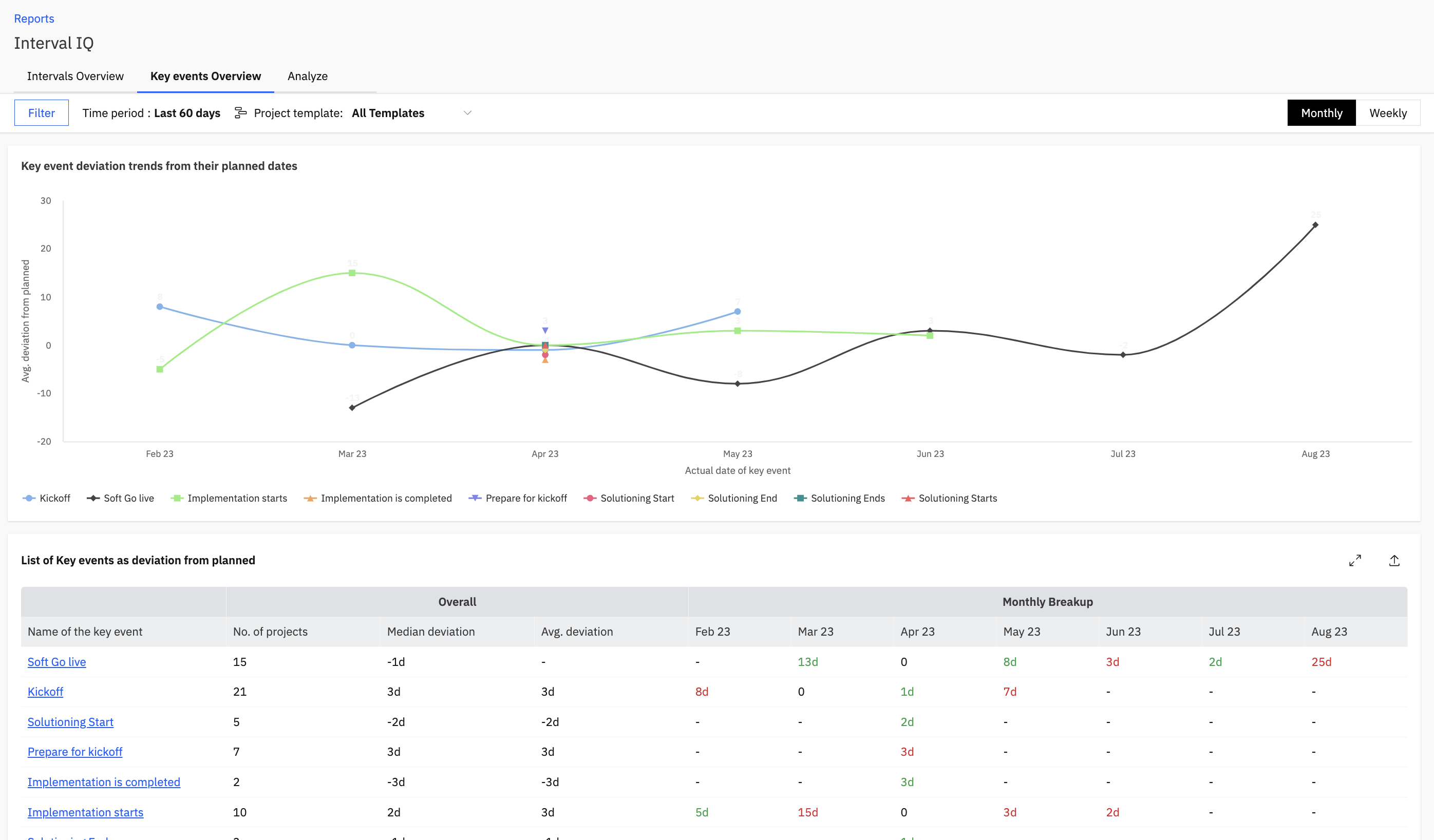
The Key Event Deviation Trends from their Planned Dates Graph
This Key events graph displays the Average Deviation from Planned Duration in days versus the Actual date of the Key Event being captured.
Each line in the graph represents a key event.
You can hover over any graph line and the tooltip will show you the name of the key event, its deviation in number of days (negative value represents early completion and positive value represents late completion or delay) and the number of projects used to calculate the average value and the time when this key event was captured.

List of key events as deviation from planned Table

This table lists the captured Key event's name, the number of Projects for which the Key event dates have been captured, Median deviation, Average deviation and the Monthly/ Weekly breakup based on the average deviation for that month/ week.
Underlying Projects Breakup
You can click on any of the key events from the 'List of key events as deviation from planned' table
and view the projects for which the key event was captured with other relevant details in the 'Underlying Projects Breakup' Table.
From this table you can get the insights and exact value of the key events captured for each individual project. This table shows the name of the project where the key event has been recorded, the planned date, the activity date and the performance.
The Performance is calculated based on the number of working days between the planned date and activity date.
You can select the key event from the table itself by clicking on the dropdown at the top.
The Analyse Tab
The Analyse Tab can be used to compare interval trends. You can intermittently create new intervals also by selecting a unique key events pair and analysing trends for the same. You can compare it to existing intervals and then choose to save the new interval also.
Click on Add Key events to create a new unique interval intermittently or click on add existing interval to view trends for a saved interval.
When you click on Add key events, you can select the key events from dropdown provided.
They Key events added will create a temporary interval and populate the List of intervals table. This table lists the captured Interval's name, Benchmark value, Median duration, Average duration and the Monthly/ Weekly breakup based on the Interval completion date.
It will populate the interval trends graph as well. The Intervals trends graph displays the Average Interval Duration in days versus the Interval Completed time depending on the month/ week in which the interval was completed.
Hey! Here's hoping that this support document was useful. You can write to us at care@rocketlane.com in case of any queries.