Dashboards help you to present your project data in a manner that visually tracks, analyses, and displays key performance indicators (KPI), metrics, as well as key data points, allowing you to monitor the current state of your projects. It is a collection of widgets that present data in a way that gives you an overview of important KPIs.
You can create your own custom dashboards in Rocketlane by adding widgets namely charts and cards.
TABLE OF CONTENTS
- How to Create a New Dashboard?
- Adding Charts to a Dashboard
- Adding Tables to your Dashboards
- Adding a New Tabular Report
- Select a Data Source:Choose the primary source for the table. Your options include:
- Adding a New Pivot Report
- Select a Data Source:Choose the primary source for the table. Your options include:
How to Create a New Dashboard?
- Click on the New dashboard button from the top right corner of the screen.

- After naming your dashboard, set its visibility to either private (only visible to you) or for everyone. Once you click Create, the dashboard will be added to your My saved dashboards list, where it will always be visible to you, regardless of whether it is private or shared.

- Click on 'Add new widget' to select from a range of default and custom widgets namely cards and charts and tables to add to your dashboard.

- Proceed to select what you would like to add to the dashboard.
Note: Adding a section creates a titled area that helps you organize and separate your charts and cards on the dashboard.
Adding Charts to a Dashboard
Here's how to create and configure a new chart:
- Name Your Chart: Give your chart a clear, descriptive name.
- Choose a Data Source: Select the primary source for your chart's data. You can choose from the following options:
- Projects
- Tasks
- People
- Accounts
- Roles
- Time Tracking
- Select a Chart Style: Choose the visual style that best represents your data, such as Bar, Pie, Line, or Donut.

- Configure the X-Axis:
- Select the field you want to use for the horizontal (X) axis.
- Based on your selection, additional filter options may become available to refine your data.

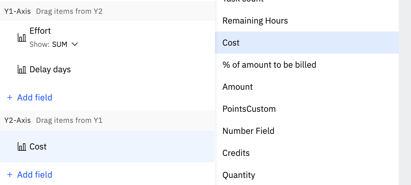
- Configure the Y-Axis:
- Select the field(s) you want to use for the vertical (Y) axis.
- Unlike the X-axis, you can add multiple fields to the Y-axis to compare different metrics.
- Add Filters (Optional): Apply additional conditions to filter the data and display only the information you need.

Adding Cards to a Dashboard
- Select a Chart Style: Choose the visual style that best represents your data, such as Bar, Pie, Line, or Donut.
- Configure the X-Axis:
- Select the field you want to use for the horizontal (X) axis.
- Based on your selection, additional filter options may become available to refine your data.
- Configure the Y-Axis:
- Select the field(s) you want to use for the vertical (Y) axis.
- Unlike the X-axis, you can add multiple fields to the Y-axis to compare different metrics.
- Add Filters (Optional): Apply additional conditions to filter the data and display only the information you need.
Cards are widgets designed to display a total or average of a numeric field, offering a quick and clear way to view important project metrics at a glance.
Here’s how to create and customize a new card:
- Name Your Card: Give your card a concise and descriptive name.
- Select a Data Source:Choose the primary source for the data you want to display on the card. Your options include:
- Projects
- Tasks
- People
- Accounts
- Roles
- Time Tracking
- Choose the Display Field: Based on your selected source, choose the specific numeric field whose total or average value you want to show on the card.
- Add a Unit (Optional): Specify a prefix or suffix (e.g., $, hours, %) to provide context for the numeric value.
- Add Filters (Optional):Apply conditions to filter the data and display only the relevant information

Note: You can customise charts and cards by applying filters for the values to be displayed. This will help you to customise the widgets based on your requirements.
Adding Tables to your Dashboards
A table widget displays your data in a list or pivot table format. You can either import an existing custom report or create a new table directly on your dashboard.
Note: To add tables to the dashboard, you must be subscribed to the Enterprise plan.
Adding a Table from a Custom Report
If you have already created a custom report, you can easily add it as a table to your dashboard:
- Select the custom report from the list of your saved reports in the dialog box.
- Click Add to Dashboard.
Adding a New Tabular Report
Select a Data Source:Choose the primary source for the table. Your options include:
- Projects
- Tasks
- People
- Accounts
- Roles
- Time Tracking
- Select Columns: Choose the fields you want to display as columns in your table.
- Add a Formula Field (Optional): You can create a new formula field to perform calculations on your data. To do so:
- Click the Add Fields > New Formula Field button.
- Select fields related to your chosen data source to use as variables.
- Name your new field and type in the formula.
- To learn more about formula fields, refer this article
- Once all columns are added, click save.

Adding a New Pivot Report
Select a Data Source:Choose the primary source for the table. Your options include:
- Projects
- Tasks
- People
- Accounts
- Roles
- Time Tracking
Select Columns: Choose the fields you want to display as columns in your table.
Select Rows: Choose the fields you want to display as rows in your table.
Select Values: Choose the fields you want to display as the values in your pivot table
Once all columns are added, click add.

Saving views
Saved views enable you to work with the same tailored dashboard utilizing different filter sets (for example, to observe various segments or thresholds) without needing to recreate the dashboard from the beginning.
- All admin users will have access to every dashboard, regardless of visibility settings (This behavior is consistent with custom report visibility, admin users will have access to all custom reports as well, regardless of visibility settings)
- Non-admin users without access to any dashboard will see a “no access” screen and wont be able to make any changes in the dashboard
- There are no changes to existing permission sets
Save a view from a dashboard
- Choose your dashboard: Open the dashboard for which you wish to set up a view.
- Set your filter: Click on Filter and enter your filter criteria. For instance: "Allocated hours exceed 2h."
- Click the Save button located next to the filter settings.
- Give a meaningful name (for example, Allocated hours > 2h) and proceed.
- Determine who can access the saved view: During the saving process, choose Make this view available for:
- Only me: The view stays private to you.
- Specific team members: Select individual team members or a group that should have access.
- All team members: The view is open to everyone in the workspace (depending on their dashboard access rights).

Open a saved view later
After saving:
- Click Default views.
- Select your saved view to apply it instantly whenever you want to revisit that filtered report.

Export Dashboards
Dashboard can be shared externally either as a one-time export or through scheduled exports.
One-time export:
- Open the dashboard.
- Click Share.
- Select Export.
This exports the current view of the dashboard as a CSV file.
Scheduled exports:
Scheduled exports deliver dashboards automatically on a defined cadence.
Scope
- Supported formats:
- PDF for cards and charts
- CSV for tables
- PDF + CSV to include both
Delivery and limits
- Files up to 5 MB are sent as email attachments.
- Larger files are delivered via a link that expires after 7 days.
- Each organization can have up to 10 active scheduled exports.
- Exports can be sent to any recipient — internal or external. The export respects the permission settings of the user who created the schedule
CSV size constraints
- Dashboard CSV exports are capped at 5,000 rows across all table widgets. For example, a dashboard with 3 tables of 3,000 rows each (9,000 total) would exceed this limit
- Recipients: supports both "To" and "CC" with no hard cap on recipient count
Schedule a Report Export
- Open the custom report.
- Click Share.
- Click Schedule export.
The Schedule report dialog includes:
Schedules remaining: Shows how many scheduled exports are still available for the organization (for example 10 of 10).
Basic info:
- Select a view: Choose which saved view to schedule.
- If the dashboard has only one view (Default View), this field appears greyed out.
- Repeats every: Set the frequency (for example every 1 week).
- On this day of the week: Select one or more days (Mon–Sun).
- Starts on / at / Time zone: Select the start date, time, and time zone.
Email recipient info: Send the export by email to Rocketlane users or external recipients.
- To: Select primary recipients.
- Add Cc: Add optional recipients.
- Email subject: Edit the email subject line.
- Email body: Add an optional message.
Report format
- CSV: Sends the table data as CSV.
- PDF: Sends cards and charts as PDF.
- CSV and PDF: Sends both.
PDF options are available only when the report contains cards or charts.
After entering the details, click Save. The scheduled export is created and the dashboard is delivered automatically by email based on the configured cadence.
Use Day-level grouping in Dashboard chart widgets
Dashboard chart widgets support multiple time granularities for date-based fields, including Day, Week, Month, Quarter, and Year. Day-level grouping is useful when a chart needs to show short-term movement (for example daily progress, daily volume trends, or daily completion counts).
Where Day grouping is available
Day grouping is available for dashboard Chart widgets that use a date-related field on the X-axis.
When Day is selected:
- Chart labels render in DD MMM YYYY format (for example, 22 May 2026).
- The date range is restricted to a maximum of 1 month (31 days) to keep the chart performant.
Allowed date ranges for Day grouping
When the widget is grouped by Day, the date range selector supports only a subset of time period options:
- This Week
- Last Week
- This Month
- Last Month
- Last 30 Days
- Custom ranges up to 31 days
The following options are not supported when Day is selected:
- This Quarter, Last Quarter, Next Quarter
- This Year, Last Year
- Last 60 / 90 / 180 Days
- Last 12 Months, Last 10 Years
- Year to Date
- Overall, Anytime
If an unsupported time range is selected with Day grouping, validation prevents the widget from running and returns a clear error instead of executing a long query.
The widget automatically adapts the date range when Day grouping is selected, so the configuration stays valid without manual adjustments:
- If Day grouping is selected while a wider range is currently set (for example Last 12 Months or a custom range greater than 31 days), the widget automatically narrows the range to Last 30 Days.
- If an existing saved widget is edited and Day grouping is applied while the widget still contains a wider range, the widget renders with an override notice:
“Date range overridden to This Month — DAY granularity supports a maximum of 1 month.” - The same override is reflected in the widget’s filter-as-text tooltip under a Date range override section.
Cross-Source Filtering in Dashboards
Dashboards keep data consistent across widgets that pull from different sources. When a filter is applied on one source, related widgets from the other source update automatically, so there is no need to maintain separate filters per widget.
Cross-source filtering works between Project-source widgets and User-source widgets.
When to Use
Use cross-source filtering when a dashboard includes both project and people metrics and the same filter context needs to apply across both, for example:
- filtering to a set of projects and viewing only the users staffing those projects
- filtering to a team or user segment and viewing only the projects they are associated with
- executive reviews where the dashboard must reflect both project health and the people involved without duplicating filters
What It Supports
- User filters on Project widgets
Apply a user-based filter (for example User status, Team member) and Rocketlane narrows Project-source widgets to only the projects linked to those users. - Project filters on User widgets
Apply a project-based filter and Rocketlane narrows User-source widgets to only the users associated with those projects.
Where to Configure It
Cross-source filtering is available when:
- the dashboard contains at least one Project-source widget, and
- the dashboard contains at least one User-source widget
Configuration is done directly from the dashboard filter panel, alongside existing dashboard filters. No widget-level setup is required.
Apply Cross-Source Filters
Open the dashboard.
- In the top filter panel, select the filter that matches the source you want to start from:
- Use a project-based filter if you want to narrow users based on projects.
- Use a user-based filter if you want to narrow projects based on users.
- Select the required values for the filter (for example, specific projects, a team member, or a user status).
- Review the widgets:
- Project-source widgets update to reflect the narrowed project set.
- User-source widgets update to reflect the users linked to that project set (or vice versa).
- (Optional) Save the filter combination as a dashboard view if this is a recurring filter setup.
Example Use Cases
Project-based utilization tracking
Filter the dashboard to a set of projects.
- Review User-source widgets such as utilization, allocation, and capacity.
- Only users staffed on the selected projects are included in those widgets.
Executive reviews
Filter the dashboard to a customer’s projects.
- Review:
- project performance widgets (Project-source)
- the people involved widgets (User-source)
- Both sets of widgets reflect the same filtered scope without maintaining separate filters.
Resource planning
Start with a user-based filter such as Team member or User status.
- Review Project-source widgets to see the projects associated with that user segment.
- Apply project filters if needed to further narrow the dashboard context.
Note:
All administrative users will have access to all dashboards, irrespective of visibility settings (This behavior aligns with the visibility of custom reports, where admin users will also have access to all custom reports, regardless of their visibility settings)
Non-administrative users lacking access to any dashboard will encounter a "no access" screen and will not be able to make any modifications to the dashboard